Problem
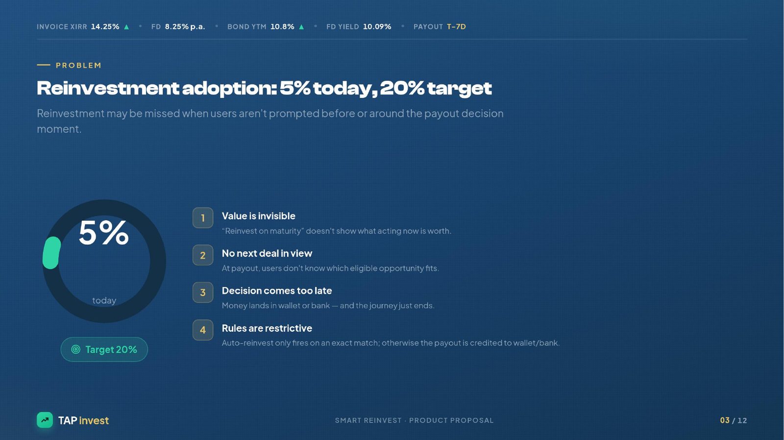
Tap Invest's reinvestment adoption sits at just 5% (target 20%). The moment money lands back in a user's wallet or bank account after a payout or maturity, the investment journey ends. Four compounding issues: (1) the value of acting now is invisible — 'Reinvest on maturity' doesn't show what it's worth; (2) at payout, users don't know which eligible opportunity fits; (3) the decision comes too late — money has already left the investing surface; (4) auto-reinvest only fires on an exact match, otherwise everything gets credited to wallet/bank.
Users
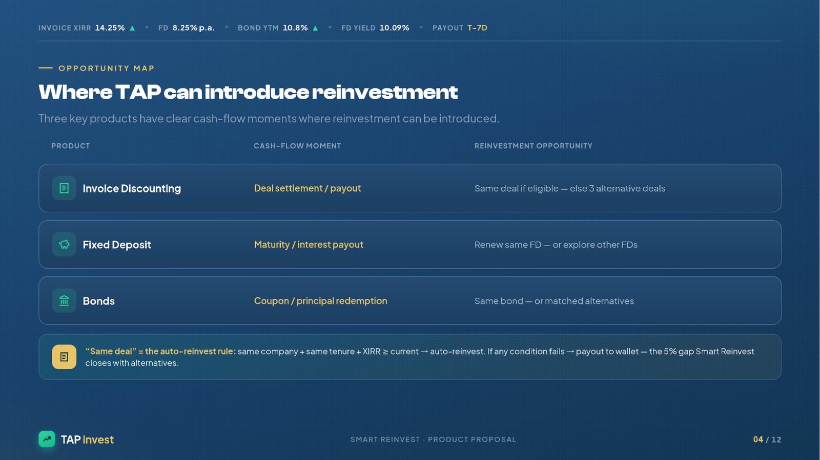
Retail fixed-income investors on Tap's Ultra platform who hold Invoice Discounting, Fixed Deposits, and Bonds. They care about their money working continuously, are comfortable with fixed-income products but often don't see reinvestment as a natural next step — because the product doesn't surface it as one. The wider ecosystem (Tap Partner, Tap Capital, BondScanner) already exists — the gap is at the investor's cash-flow moment.
Hypothesis
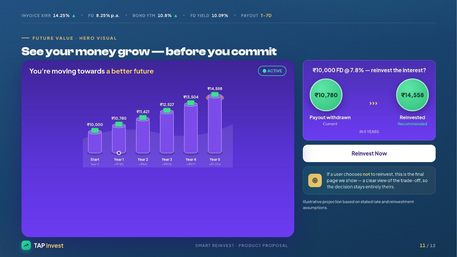
If we prompt users before the payout hits (not after), project the future value of acting now, and surface 2-3 personalised reinvestment options with transparent yield/rating/tenure — reinvestment adoption will move meaningfully toward 20% because the decision moment is placed inside the investment surface, not at the wallet.
Wireframes
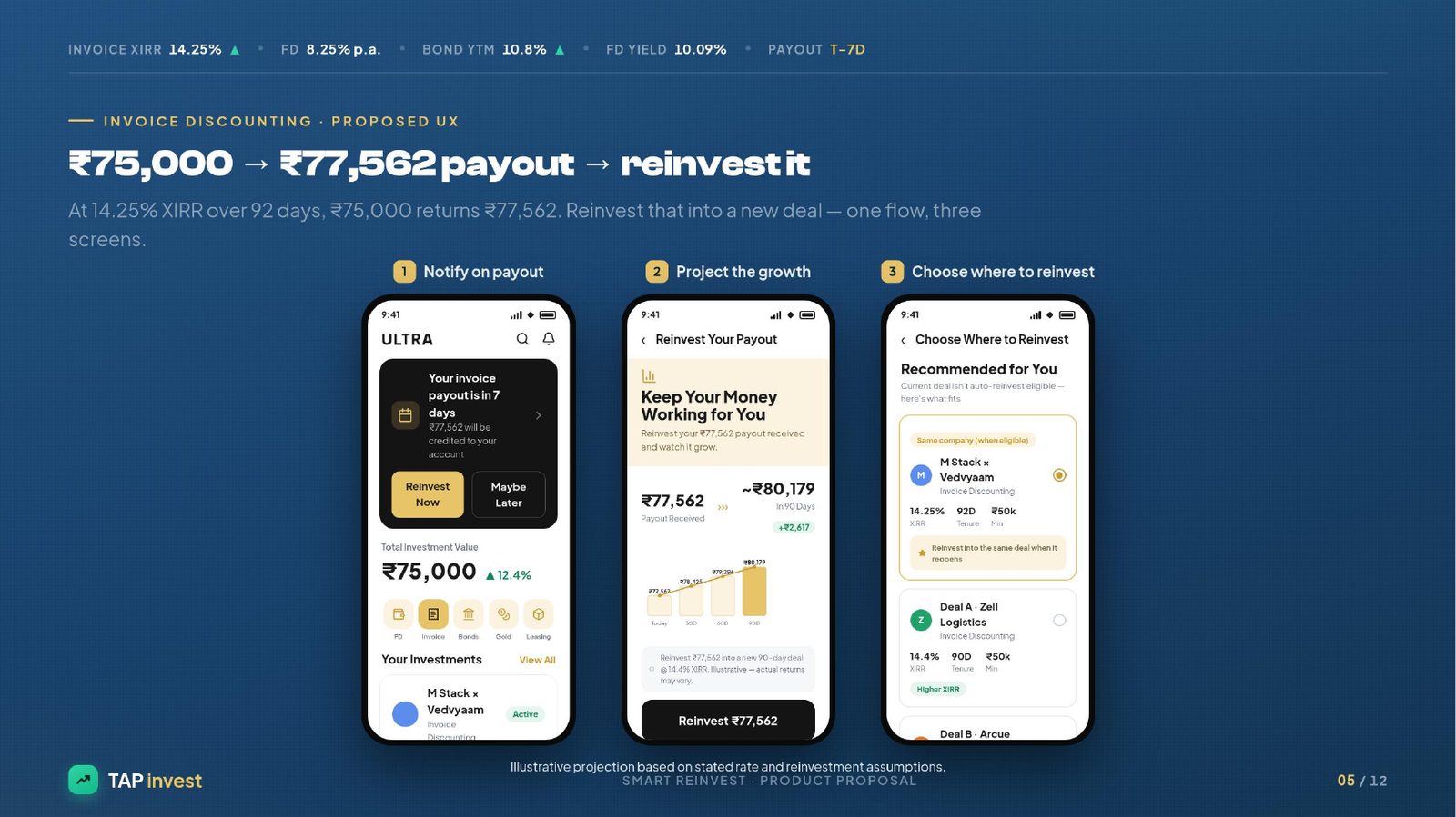
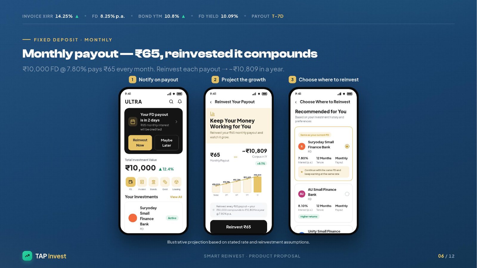
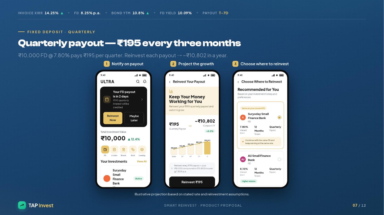
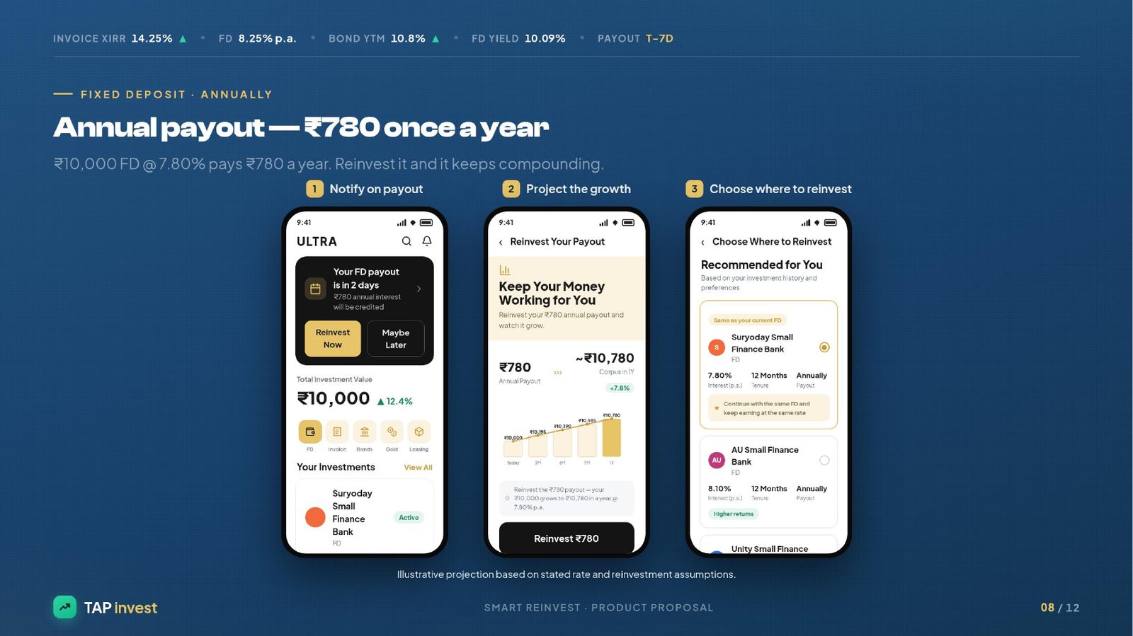
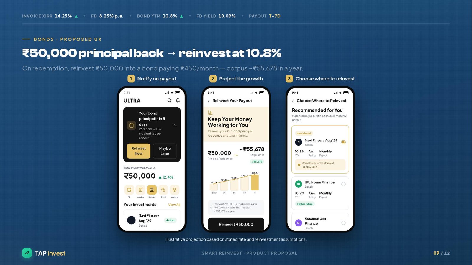
I mapped a 3-screen flow per product (Invoice Discounting, FD monthly/quarterly/annually, Bonds): (1) Notify on payout — 'Your invoice payout is in 7 days. ₹77,562 will be credited' with Reinvest Now / Maybe Later; (2) Project the growth — 'Keep your money working' with a line-graph corpus projection over 30/60/90 days; (3) Choose where to reinvest — recommended options tagged 'Same as current FD', 'Higher returns', 'Higher rating', each showing XIRR/YTM, tenure, min-investment, payout frequency. If the user chooses not to reinvest, a trade-off view keeps the decision honest and theirs.
Solution
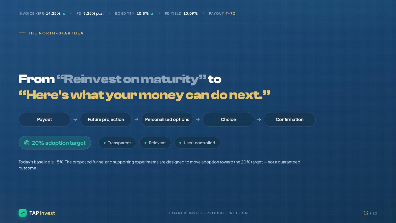
Smart Reinvest — a proactive, transparent, user-controlled reinvestment flow. North-star: shift the framing from 'Reinvest on maturity' to 'Here's what your money can do next.' Every payout triggers Notify → Project → Choose → Confirm. Rules relax from exact-match auto-reinvest to guided, flexible recommendations. Bonus: I flagged a DigiLocker verification friction point observed during onboarding — a compounding drop-off worth fixing alongside the reinvestment surface.
Inside the teardown.


Why this teardown stuck with me.
This one drew me in because the metric (5% adoption) hides a design failure, not a user failure. Tap has already earned the trust — the user has invested, waited, and is about to get paid. That's the highest-intent moment in a fixed-income journey. The current flow spends it silently: money lands in the wallet and the investing screen goes quiet. Smart Reinvest doesn't add a new product — it just moves the decision to where the user is already leaning forward. When you replace 'auto vs manual' with 'notify → project → choose', you get a growth lever and a UX win at the same time. That's the kind of product-led compounding I want to keep designing for.
What I'd take with me.
Fixed-income users don't dislike reinvestment — they simply lose the moment. Placing the decision before the payout hits the wallet, and pairing it with a visible corpus projection, is the difference between a 5% adoption product and a 20% one. Auto-anything is not the answer; transparent guidance is.